
Scaling eCommerce systems across a multi-brand portfolio.
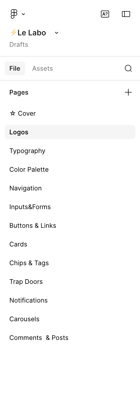
A portfolio showcase focused on brand identities and design system architecture: shared components, brand-specific theming, organized Figma libraries, documentation, and responsive templates across Estée Lauder, Balmain, Tom Ford Beauty, Le Labo, MAC, Bobbi Brown, and Dr. Jart+.
The challenge
Each brand had its own audience, voice, and visual language. MAC leaned bold and expressive. Tom Ford was quiet and restrained. Le Labo was editorial. Dr. Jart+ was clinical and clean. Balmain was fashion-forward. Estée Lauder sat at the center as the flagship.
Building separate systems for each brand was not sustainable. Custom builds slowed delivery, fragmented teams, and made it harder to keep quality consistent across the portfolio.
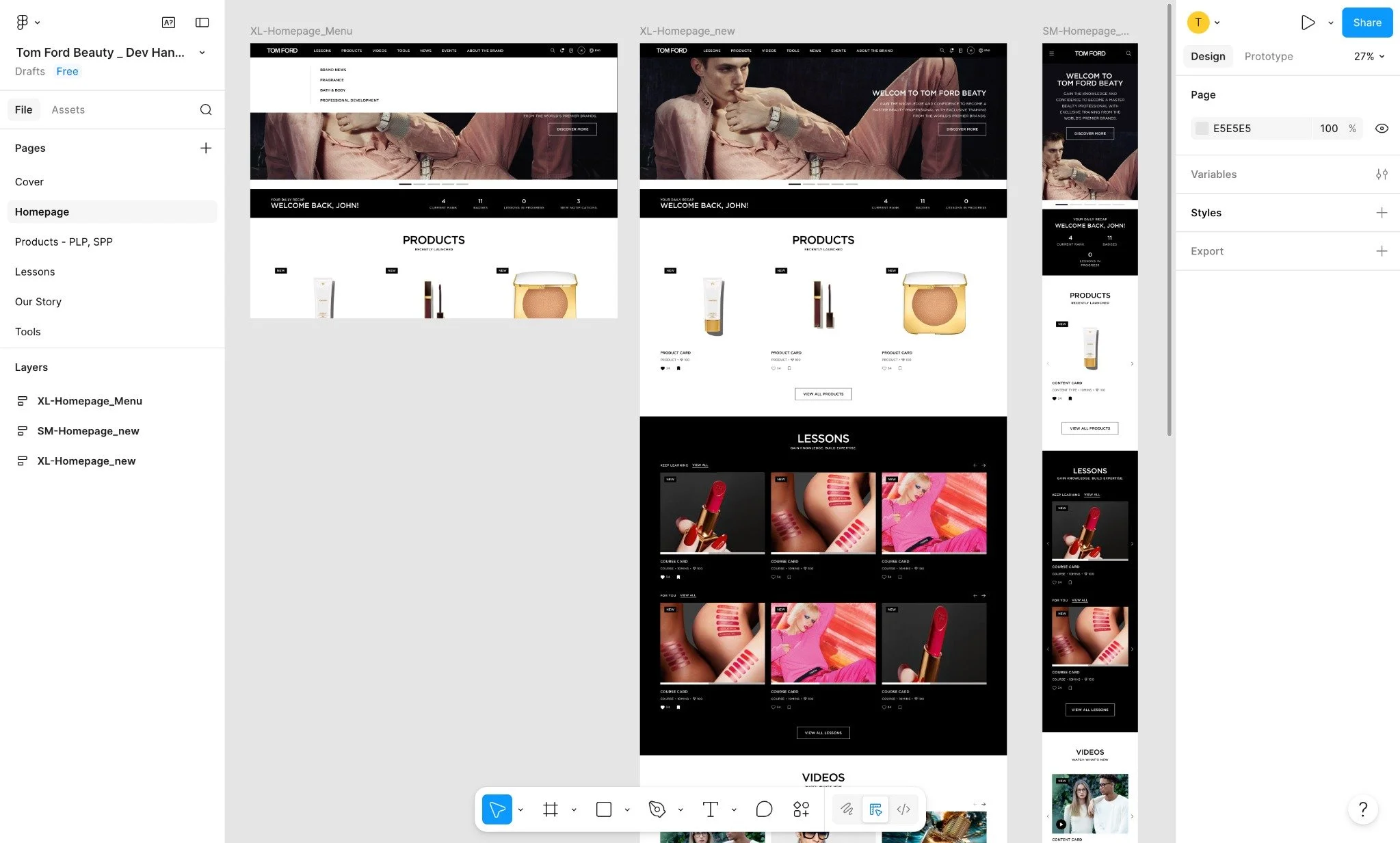
The work was to define a scalable design system that could be reused across brands while letting each one keep its identity, and to reduce the need for custom builds so new implementations could ship faster.
The strategy
Defined a shared system across brands
Defined and scaled a component-based system used across multiple Estée Lauder brands.
Standardized core structures such as:
product listing and detail layouts
navigation patterns
content and editorial modules
cart and checkout flows
These decisions created a consistent foundation across brands while supporting different use cases.


Balanced system constraints with brand identity
The key tradeoff was between consistency and brand expression.
Standardized structure and behavior, while letting brands control:
typography
color
imagery
content tone
This ensured each brand felt distinct without requiring separate systems. MAC could feel loud. Tom Ford could feel quiet. Both ran on the same components underneath.
Results
Reduced duplication across design and development
Faster rollout of new brand experiences using shared templates
More consistent user experience across the Estée Lauder portfolio
Improved collaboration between design and engineering teams
Stronger brand expression within a shared structure
The impact came from defining what needed to be consistent and what needed to remain flexible.
Standardizing core structures while letting brands control visual expression made it possible to scale across multiple brands without slowing down delivery or requiring custom builds each time.